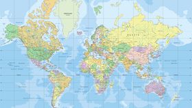


The world is not quite what it seems. Most of the maps you see day-to-day are based on Mercator projection. Designed almost 450 years ago, even Google Maps used a variant of this projection until just a few months ago.
However, as you can see below, it’s surprisingly bad at accurately reflecting the true size of many countries.
Neil Kaye, a climate data scientist at the Met Office in the UK, has designed a map visualization that alternates between the Mercator projection and true projections of a country's area relative to other countries. The GIF elegantly shows how the Mercator projection distorts the true size of many countries, especially those further away from the equator.
Just take a look at how severely Russia, Canada, and Greenland changed size. Europe, parts of Asia, and the US also shrink away a considerable amount. The Mercator projection depicts Greenland as a landmass larger than Africa, however, in reality, Africa's area is a whopping 14 times greater than Greenland's.
"Each country is projected to the spherical projection and placed at the center of where it appears in the Natural Earth projection," Kaye explained on Reddit.
"There was then some manual tweaking of countries that are closer to the poles," he added.
"This demonstrates you can't fit shapes on a sphere back together again once you put them on the flat."
The Mercator projection was first presented by the Flemish cartographer Gerardus Mercator in 1569. It's been extremely useful for exploration as it allows a navigator to plot a straight-line course and maintains the country’s true shape, but when you translate a three-dimensional shape, such as a globe, into a two-dimensional projection, something’s got to give. In this case, it’s distorting size and distance as you get closer to the two poles.
The Mercator projection has also been accused of having political undertones by presenting a Eurocentric colonial view of the world. As a result of all of these biases and shortcomings, some schools in Boston even decided to get rid of the map in favor of the alternative Gall-Peters world map. However, this projection isn’t “perfect” either. While it preserves the area measure of the landmass more accurately, it distorts its shape.
In August 2018, cartographers released the Equal Earth projection map in the hopes of overcoming all of the problems found with the world’s numerous map projections. The debates within cartography (of which there are many) will undoubtedly continue to rumble on, but the scientists of Twitter appeared to be pretty satisfied with the results.