

Today, it was announced that July 2016 was the hottest month on record, while June 2016 was the hottest June ever recorded. In fact, it marked the 14th consecutive month where temperatures were the hottest for that month on record. And while around 97 percent of climate scientists believe humans are the leading cause of it, not everyone is convinced that man-made climate change is real, even if the evidence is thrown towards them. Literally.
Just last night, there was a tussle on the ABC show "Q&A" in Australia between the UK's Professor Brian Cox and Australian senator Malcolm Roberts, one of four senators elected from the Australian right-wing populist party “One Nation”.
Roberts began by arguing that the “warming cycle at the 17th century, going into the 18th century, was faster and greater than the lastest warming cycle” that finished in 1995. He said he believed there had been a “pause” in rising temperatures for the past 21 years.
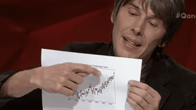
The Senator then criticized Cox for favoring consensus over empirical evidence, to which Cox replied: “Can I just say, I brought the graph.” He then proceeded to pull out the Global Land-Ocean Temperature Index, a graph of global surface temperatures over the past century. Cox added: “Also, secondly, I’ve brought another graph. It is correlated with that, which is the graph that shows the CO2 emissions parts per million in the atmosphere.”
But Roberts wasn’t happy with that empirical evidence.
"The data has been corrupted, and we know the 1930s were warmer than today," Roberts said.
"What do you mean by corrupted?" Cox asked.
"It's been manipulated," Roberts said.
"By who?"
"By NASA," Roberts said.
By this point, the host told the audience to quiet down because the laughs were smothering the debate.
After more talk with the rest of the panel, Roberts continued: “All policy should be based on empirical evidence. I've heard consensus, which is not science. I've heard appeals to authority, which is not science."
Cox decided to give the deciding blow by saying “you’ve seen a graph”, and lightly threw the empirical evidence towards Roberts.