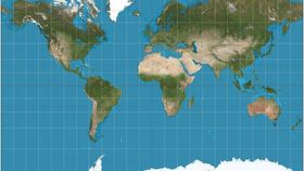


The truth is that every map tells a lie, but they don’t all lie about the same thing. For example, Mercator projection maps—one of the most common in use today—exaggerate regions far from the equator. The Goode homolosine projection (pictured below) shows continents that are sized appropriately to one another, but with many interruptions and distortions of distance.
The rest of this article is behind a paywall. Please sign in or subscribe to access the full content. 
Image Credit: Strebe / Wikimedia Commons
This give-and-take of benefits has been a perennial problem in cartography. The issue is due to projection, which in map-making results from trying to turn a spherical globe into a flat plane.
One of the most popular projections is the Mercator, but of course, it too has its flaws. In truth, Africa is 14 times larger than Greenland, Canada is only 1.2 times the size of the United States, and Antarctica is definitely not the colossal continent it is portrayed to be.
However, don’t get the idea that the Mercator is a bad map. It’s not. The map preserves “true compass bearings between any two points” and has become a standard in nautical navigation.
Since there is no perfect map for all occasions, your best bet is to pinpoint what you need a map for and then to weigh the advantages and disadvantages of each to suit your goal.
For some fun facts about the Mercator map, watch the BuzzFeedBlue video below.