

Geographers at the University of Cincinnati have created a map to demonstrate just how much the planet has changed over 25 years. The result is a glorious (and slightly trippy) swirl of color.
Unfortunately, the practical implications of these patterns are not quite as pretty as the design itself. This is because it exposes the fact that as much as 22 percent of Earth's habitable surface was altered considerably in the years between 1992 and 2015, whether it be due to deforestation, water loss, or urban spread.
"It’s very informative. There is nothing else like it," said Tomasz Stepinski, a UC professor who worked on the project now published in the International Journal of Applied Earth Observation and Geoinformation.
"There are maps of forest loss but no maps showing everything."
To create the map, Stepinski and co. used high-resolution satellite images captured by the European Space Agency to study climate change, a process the organization began back in 1992. Specifically, the team used two images – one from 1992 and one from 2015.
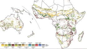
The images are so detailed, the researchers were able to divide them into 300-square-meter (3,200-square-foot) grids (pixels). For each of these pixels, the team used 22 land-use categories (types of forest, farmland, wetlands, grasslands, and urban development) to measure how the environment changed in the space of a quarter of a century.
But there was a problem. The result was a map so detailed that it was virtually impossible to analyze on a global level. It looked like a "bowl of Fruity Pebbles," according to a statement on the research.
So instead, the team extended the size of the pixels to 9 kilometers (5.6 miles) and reduced the number of land-use categories to 9. They then used three shades of color to display the extent of the change. This means it's now possible to see broad trends in land-use change but researchers can still zoom in and study changes on a 300-square-meter scale.

“Of course, it raises alarm bells. But they’re not new ones,” Stepinski added. "We already knew about deforestation or wetland loss or increasing urbanization. But now we can see exactly where all of that is happening.
"What makes this so depressing is that it’s examining a timescale that is shorter than our lifetime."
So, what are some of the key takeaways?
While the Sahara Desert expands, the US is losing wetlands in its southeast. The map also paints a picture of a world that is becoming increasingly urbanized.
But perhaps most timely is the effect of deforestation in Central America. The migrant caravan has been the centerpiece for multitudes of headlines and presidential tweets in recent weeks but Stepinski says climate change (and, subsequently, crop failures) is only part of the story.
"[T]hey’ve lost the forest because people use wood for fuel," he added. “It’s one part of the refugee crisis.”
The researchers say the map – and its assessment of land-use changes – will be important to help plan and manage the resources we have left.
“I hope this map will make people more aware of the human impact on our planet,” lead author and former UC postdoctoral fellow Jakub Nowosad explained.
"As a society, we need to be better informed of the scale of changes we make to the Earth, and in my opinion, this awareness can influence future changes in environmental policies," he said, adding that the map cannot be used to predict what's in store over the next 25 years but if demographic changes are anything to go by, our footprint will only get larger.