

Climate change is one of the biggest threats currently facing the planet, if not the biggest threat. So much so that the World Economic Forum has warned we are "sleepwalking into catastrophe".
The planet is already starting to feel some of the effects of this change, from the record-breaking heatwaves in Australia to the number of extreme weather events in the US. Yet, it can be extremely hard to picture how something as seemingly abstract as climate change will affect us in the future – and this is where Matt Fitzpatrick from the University of Maryland Center for Environmental Science steps in.
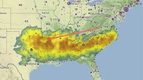
Fitzpatrick and his colleague Robert R. Dunn have built an interactive map, matching 540 urban areas across the US and Canada to towns and cities whose contemporary climate mirrors what they can expect to see in the future. The purpose of the map and the accompanying study, published in Nature Communications, is to raise awareness over the very real, very tangible implications of climate change for the 250 million or so people living in North America's urban centers.
Warning: the result is quite alarming.
"We show that climate of most urban areas will shift considerably and become either more akin to contemporary climates hundreds of kilometers away and mainly to the south or will have no modern equivalent," the study authors explain.
The map considers two options: one, that nothing is done to curb our appetite for fossil fuels and greenhouse gas emissions continue to rise and two, something is done to mitigate climate change and emissions peak in 2040 before declining. If we continue along the first path, the authors find, the climate of an average North American town or city will look like that of a location 850 kilometers (530 miles) to the south.

And so by 2080, the climate of Washington DC will look akin to that of Greenwood, Mississippi in the unmitigated scenario. Alternatively, it could look like Paragould, Arkansas in the mitigated scenario. In New York, it is Jonesboro, Arkansas (unmitigated scenario) or Annapolis, Maryland (mitigated scenario). While in Los Angeles, it's Las Palmas, Mexico (unmitigated scenario) or virtually unchanged (mitigated scenario).
To create the map, Fitzpatrick and Dunn collated information from climate change datasets including one that looks at current climatic conditions, a second that considers climatic predictions, and a third that measures historic climate variability. They also used a total of 27 different Earth system models to calculate the average temperature change for each of the 540 urban areas (530 in the US and 10 in Canada).
"Within the lifetime of children living today, the climate of many regions is projected to change from the familiar to conditions unlike those experienced in the same place by their parents, grandparents, or perhaps any generation in millenia," the study authors add.
"While scientists share great concern for the expected severe impacts of climate change, the same is not necessarily true of the general public."
This, they hope, will change that.