Space and Physics
 PUBLISHED




What you'll discover in this article
- Curiously, the August 12 total solar eclipse appears to move backwards on maps, traveling from west to east instead of east to west as all eclipses do.
- This is caused by a cartographic illusion created when we try to map a 3D spherical object like Earth on a 2D plane like a map.
- If the differences in globe maps and flat maps were more widely known, not only would we be less confused by this illusion, but people may be less likely to believe in conspiracies like Flat Earth.
If you look at some maps of this week’s total solar eclipse, you may notice something odd: part of its path seems to be going backwards. There’s a fair chance you haven’t noticed this, because many maps of the eclipse leave that section off, but it’s more obvious on the maps from the annular solar eclipse that happened in February earlier this year.
In a world that increasingly feels out of joint, it can almost seem plausible that the Moon’s shadow, if not the whole Moon, would start moving the wrong way, but of course that’s not happening. Instead, the effect is a product of the way we try to map our almost spherical planet onto a flat plane.
Maps of lunar eclipses show them going from east to west, as the turning of the Earth lets progressively more western locations see the Moon rise. A solar eclipse does the opposite, moving west to east. Yet for parts of each of 2026’s eclipses, on maps that’s not how it looks.
A shadow’s journey
Total solar eclipses only occur over a thin strip of the planet, usually around 200 kilometers (120 miles) wide, but also thousands of kilometers long. On either side of this narrow area, known as the umbra, large portions of the planet get to witness a partial eclipse. This is the penumbra. Umbras curve across the Earth, a product of the orbit of the Moon interacting with the rotation of the Earth.
As NASA explains, the reason the movement is from west to east is that this is the direction of the Moon’s orbit. The Earth is spinning the same way, but not as fast. The Moon’s orbital speed is about 3,700 km/hr (2,300 mph). The rate of the Earth’s rotation depends on latitude; a spot a meter away from one of the poles moves at just meters per hour. Even at the equator, movement is less than half as fast as the Moon, 1,600 km/hr (1,000 mph).
Since the Moon, and therefore its shadow, is outrunning us, we see it sweep past from west to east.
The Moon’s orbit is tilted relative to the Earth’s equator, so there is usually also a north-south component to the shadow’s path
Maps of the majority of eclipses show this fairly clearly: see a typical example below:
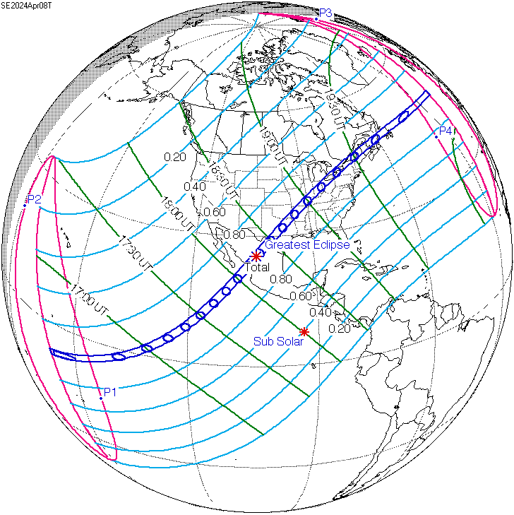
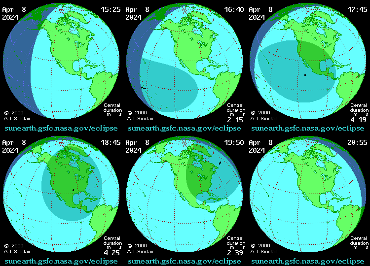
For next week’s eclipse, maps show that a great deal of the movement is north-south, but there is a drift towards the east, particularly towards the end, so everything seems fairly normal.
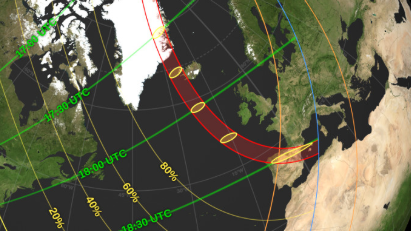
However, these maps, understandably, are about the parts of the eclipse path where people live, or might want to go to watch it. More complete maps also show the eclipse’s path across the Arctic Ocean, and on these it looks like the start of the path is east to west.
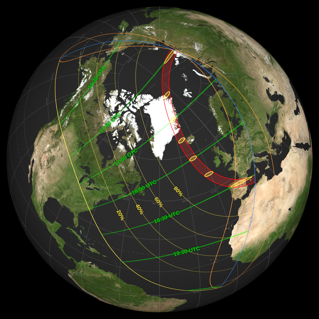
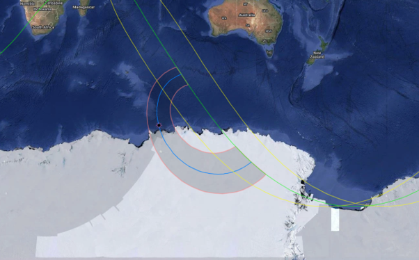
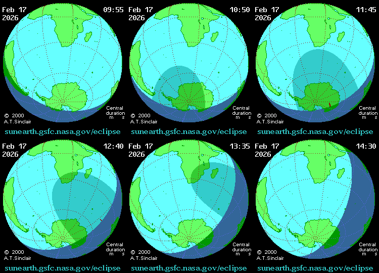
If you’re struggling to make that out, take a look at this map of the annular (“ring of fire") eclipse in February.
Not passing over any populated areas, and without the highlight of totality, this one didn’t draw much attention. Even though there is no totality, the path of the area of greatest eclipse certainly looks like it bends back on itself, going eastward before it turns westward.
All About The Maps
Have we somehow managed to outrun the Moon, even briefly? No.
As you may notice, this pair of eclipses are drawn together not just by their year, but how close they are to the Earth’s poles. If the Moon’s orbit was perfectly aligned with the Earth’s, we’d see a total eclipse every month, and they’d always be over the tropics.
The orbits not being coplanar means that the Moon usually passes either above or below the Sun from our perspective, or to put it another way, its shadow misses the Earth, passing above one of the poles. This year’s eclipses just sneak in, happening near the far south and north.
In a three-dimensional model of the Solar System, next week’s lunar shadow starts over Siberia. It originally tracks mostly north, but also eastwards, until it skirts the pole. Eventually there is nowhere further north for it to go, and it starts moving south towards, and then across, Greenland. By the time it reaches the North Atlantic, the eastward bend is becoming more obvious, and that accelerates on the way south.
However, any flat map of the surface of a spherical object involves a level of distortion. Something’s got to give. To work around this geometrical difficulty, the Mercator projection, the world map everyone knows, distorts the sizes of landmasses: regions near the poles appear larger, while areas near the equator are shrunk.
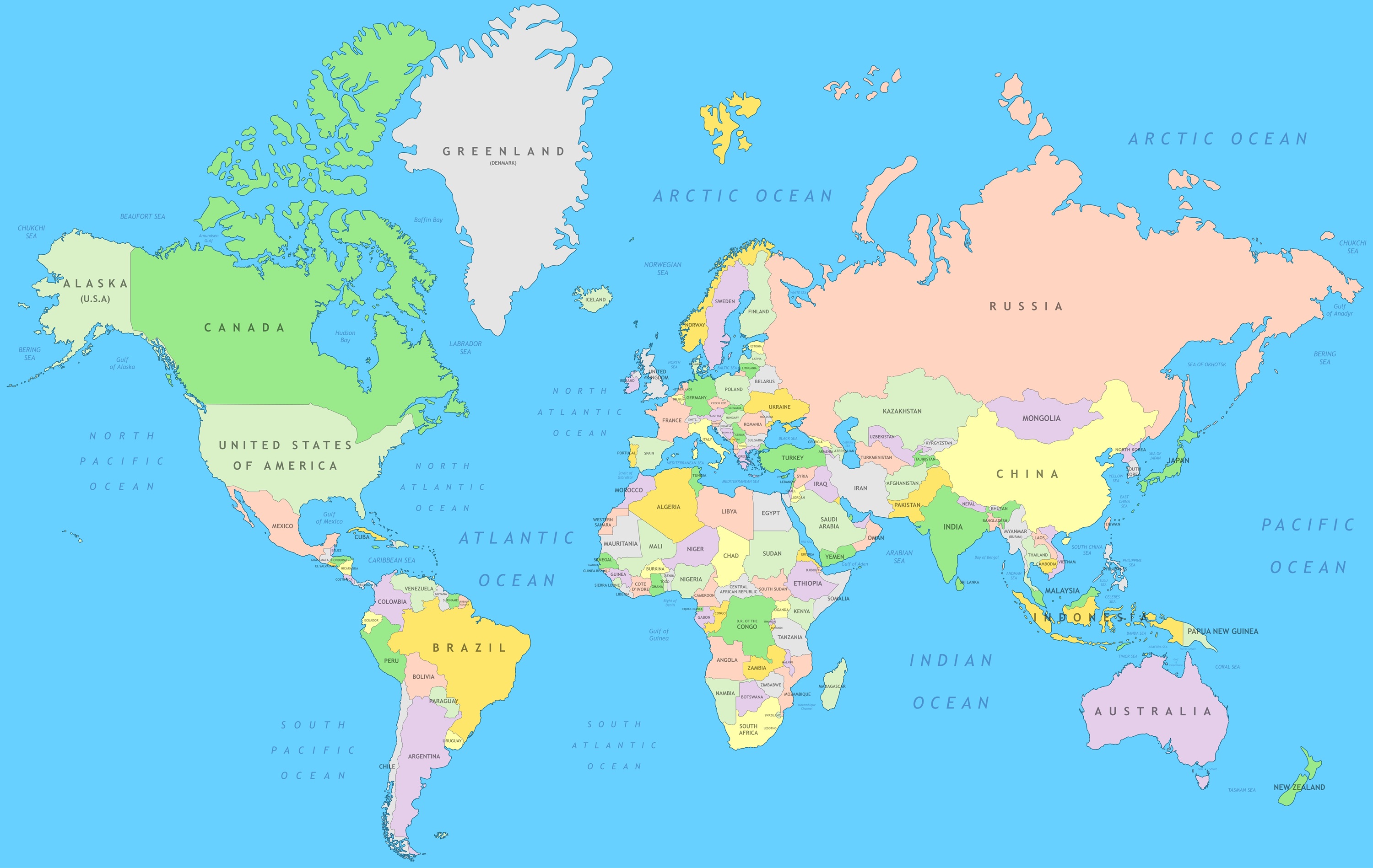
As XKCD once revealed, there are an astonishing number of ways to represent the Earth on a two-dimensional map, but all of them create optical illusions of one sort or another. You can argue about which distortion is the most acceptable, and people certainly do, but most of the options try to confine these distortions to the areas near the poles.
With so few people living at very high latitudes, these distortions don’t bother us very often, until something interesting happens in the far north or south, like an eclipse. In this case, the distortions make it look like the first part of the path is taking the umbra westwards, when it’s really moving east.
The reason the February eclipse illusion is so much more obvious than this month’s one is that most projections have a Northern Hemisphere bias, and distort Antarctica more than the Arctic.
Flat maps but not flat Earth
We joked at the start about blaming Flat Earthers for this, and while they are not right about anything, the illusion is not their fault. Sometimes maps need to be flat, and as noted, that brings distortions that create illusions.
Nevertheless, the fact that we’re so used to seeing the world in a way that isn’t quite right may be part of the reason this long-debunked idea has resurfaced thousands of years after it should have died.
If we took more opportunities to familiarise ourselves with globe maps and note the differences with flat maps, we might be less confused by this illusion and less prey to wacky conspiracy theories. They say "touch grass", but sometimes it's best to touch a globe.