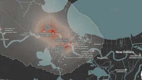


Air pollution is responsible for 4.2 million deaths around the world every year. Now, the team at ProPublica has created an incredibly detailed map that shows the worst areas for toxic, cancer-inducing air pollution in the United States.
The rest of this article is behind a paywall. Please sign in or subscribe to access the full content.The map is based on data from the US Environmental Protection Agency (EPA). ProPublica analyzed the data and its limitations (which are discussed here) and found that about 250,000 people live close enough to more than 1,000 toxic hotspots in the US. They believe these people might have been exposed to pollutants in the air that can lead to an increase in rates of cancer.
“The agency has long collected the information on which our analysis is based. Thousands of facilities nationwide that are considered large sources of toxic air pollution submit a report to the government each year on their chemical emissions,” the team writes in a summary of their work.
“But the agency has never released this data in a way that allows the public to understand the risks of breathing the air where they live. Using the reports submitted between 2014 and 2018, we calculated the estimated excess cancer risk from industrial sources across the entire country and mapped it all.”
The EPA threshold for acceptability is a cancer risk of 1 in 10,000. That means that for every 10,000 people living in that area, over a lifetime of exposure, there will be one more case of cancer. ProPublica’s map highlighted areas where the cancer risk is greater than 1 in 100,000, 10 times lower than the EPA’s threshold.
If you want to look up your area, the complete map can be found here.