

If you glanced at the London underground map for the first time, you probably wouldn’t think there’s much to write home about. Color-coded lines, dots and zones: it’s pretty easy to run your finger over and work out a journey. But residents and frequenters of the city know that it’s completely inaccurate. Distance between points, and where the points are, often don’t reflect actual distances or locations with respect to other areas. Take Embankment, for example. The map would have you believe that Waterloo and Charing Cross are similar distances from it. In fact the latter is quite literally a stone’s throw away, while the former is more than 10 minutes' walk across the Thames.
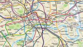
The original. Transport for London
Does anyone really care? Not massively, it does the job. But it turns out that Transport for London actually had a geographically accurate version, they just didn’t share it with anyone. So last year, one man, named James Burbage, decided to write to the company and request it. And thanks to the Freedom of Information Act, they revealed it. Of course, it looks totally different, and helps you see why perhaps the misleading version is favored.
The original, simple map that we see plastered around tube stations was created some 80 years ago by Harry Beck, stripping back the higgledy piggledy network into a series of neat, easily traceable lines. At first it was deemed “too radical,” but it turned out to be exactly what tube riders wanted, and now it’s somewhat of an icon. Its remastered version, however, wasn’t fashioned with the consumer in mind, but rather for engineering works. You can check it out in more detail here.
[H/T: The Independent]