Culture and Society
 PUBLISHED
 1
1


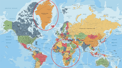


When you look at a map, Greenland looks pretty astonishingly big, taking up almost as much map space as the whole continent of Africa. But in truth, it's not that big; its unusual size comes down to its position on the Earth, and how we represent a 3D world on a 2D map.
Representing a 3D world on a 2D map is always going to end up with some issues and some compromises. No matter how accurate you try to make it, you will end up with stretched areas, squashed countries, or parts of the map cut out altogether.
The map you are likely familiar with is one based on the Mercator projection, first presented by cartographer Gerardus Mercator in 1569. It's a cylindrical map projection, in which you place the globe into a cylinder and then project each point of the map onto a corresponding point on the cylinder. Meridians (imaginary vertical lines going through the Earth from the North to the South Pole) are mapped onto vertical lines equally spaced apart on the map, and circles of latitude (imaginary horizontal lines from east to west) are mapped onto equally spaced horizontal lines.
The Mercator projection is good for navigation because it represents courses of constant bearing as straight segments, meaning ships have to course correct for the curvature of the Earth less frequently. However, it also results in distortions of size and shape. In cylindrical maps – as is the case with the Mercator projection – areas around the equator remain roughly accurate, but the further you move from the equator, the more distorted and inflated landmasses become.
Essentially, this is why Greenland appears gigantic and is represented as the same size as Africa, when in fact it's 1/14 as big. Greenland is actually around 2.16 million square kilometers (836,330 square miles), including its offshore islands. That's about three times the size of the US state of Texas, which is still pretty big, but nothing compared to Africa's 30.37 million square kilometers (11.7 million square miles).
There are maps that show you the true size of countries, but you wouldn't want to navigate using them.
“One can’t make everything perfect,” Richard Gott, emeritus professor of astrophysics at Princeton, explained in 2021 regarding their new, two-sided flat map. “A map that is good at one thing may not be good at depicting other things.”
The Mercator projection, for example, depicts local shapes well but distorts the surface areas near the North and South Poles to the point that the polar regions are often chopped off.
In 2007, Gott and his colleague David Goldberg developed a system for scoring maps based on measurement of distortions within them, finding that the Winkel-Tripel projection scored the best for having the fewest distortions.
However, it wasn't perfect, including a "boundary cut" in the Pacific Ocean, making the distance between Hawai'i and Asia appear bigger than it actually is.
Years later, the team decided to make their own flat map, drawing inspiration from a map made by Buckminster Fuller, which preserved the size of countries and areas by turning the world into this monstrosity, introducing big gaps between close countries and hacking several in two.
The team had the idea of creating a two-sided map, showing either the Eastern and Western Hemispheres or the Northern and Southern Hemispheres. On the Northern-Southern Hemisphere map, the edge of the map is quite neatly the equator, and both versions include no boundary cuts.
“If you’re an ant, you can crawl from one side of this ‘phonograph record’ to the other,” Gott said. “We have continuity over the equator. Africa and South America are draped over the edge, like a sheet over a clothesline, but they’re continuous.”
Using the map, you can measure distances between two points more accurately than on any other map, as it includes fewer distance errors. According to their score system, it is the most flat map of Earth.
“Our map is actually more like the globe than other flat maps,” Gott added. “To see all of the globe, you have to rotate it; to see all of our new map, you simply have to flip it over.”
While the flat map is good, there's nothing quite like playing around with a map for yourself and finding out how big your own country is in relation to everything else. One interactive map that does this is "The True Size Of...". You can select the country you're interested in comparing and drag it over other areas of the map to see how big it really is. We recommend starting with Greenland, taking the country and dragging it down to the equator to see how its size compares out of its inflated position.