Nature
 PUBLISHED
 46
46

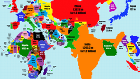


Where in the world did Australia go?! A new cartogram by Redditer TeaDranks rescales the world’s countries according to population size instead of geographic area.
Reconstructing maps based on different variables can be a powerful tool for understanding the world we live in. In this case, certain regions almost disappear from the map while others expand considerably; Canada transforms into a thin, jagged line while India now takes up a massive amount of space.
Other interesting tidbits: North Korea has a larger population than Australia, with 25.1 million people compared to 23.7 million, respectively. Denmark has almost disappeared from the map compared to the mighty space it usually takes up, and China now dwarfs Russia instead of vice versa.
“I was inspired by this map which is now ten years old,” said TeaDranks. “My map's scale is twice as large as the old one’s.”
It is important to note that even modern world maps distort the Earth. The problem is due to projection, which in map-making results from trying to turn a spherical globe into a flat plane. Cartographers try to combat this geometrical distortion through a variety of techniques, each with their own flaws and strengths.
To check out a high-resolution version of the map, click here.
Credit: TeaDranks / Reddit