

The globular nature of the planet (sorry, flat-Earthers) makes map making a difficult art.
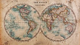
The map you probably recognize is based on the Mercator projection map, invented by a Flemish geographer and cartographer called Gerardus Mercator in 1569, but it's problematic. This was a point in history when people were still decorating their maps with illustrations of sea monsters, which they believed to be accurate depictions of marine life – so there was definitely room for improvement as far as scientific accuracy was concerned.
The major problem is that it vastly underestimates the size of countries in the Southern Hemisphere and exaggerates those in the Northern Hempishere. So, Africa and South America appear (relatively) small, while the magnitude of countries like Canada, Greenland, and those in Scandinavia is overstated.
Why do we continue to use a map that is so fundamentally flawed? Because no one has been able to come up with a solution to the perspective problem.
Either you have a map, like the Mercator projection map, that preserves the angles (and shape) of the landmass but distorts the size of said landmass. Or you have a map like the Gall-Peters projection map (more on that later), which preserves the area measure (or size) of the landmass but distorts its shape. Until, maybe, now.
The new map is called the Equal Earth projection map and was designed by cartographer Tom Patterson and his colleagues, Bojan Šavrič and Bernhard Jenny.
"We searched for alternative equal-area map projections for world maps, but could not find any that met all our aesthetic criteria. Hence the idea was born to create a new projection that would have more ‘eye appeal’ compared to existing equal-area projections and to give it the catchy name Equal Earth," the team explained in an article published in the International Journal of Geographical Information Science earlier this month.
This search was a response, the authors explain, to the news that Boston public schools were chucking out the faulty (and Eurocentric) Mercator projection map in favor of the Gall-Peters projection map.
"As professional cartographers, though, we know that equal-area projections are not the panacea that these organizations might think," the authors continued. "For example, continental shapes suffer."
Patterson and co. took inspiration from the Robinson projection map, which was designed by a man called Arthur H. Robinson in 1963. It was later adopted by the National Geographic Society (NGS) as their map of choice in 1988.
Robinson's creation is not quite an equal-area projection like the Gall-Peters projection map or a "conformal" projection like the Mercator projection map, but somewhere between the two. This makes it a compromise but "highly suitable" for making world maps, the authors said.
You might consider the Equal Earth projection an upgrade of the old Robinson projection. “The Equal Earth map projection is a new equal-area pseudocylindrical projection for world maps. It is inspired by the widely used Robinson projection, but unlike the Robinson projection, retains the relative size of areas."
Well, it seems the scientists of Twitter approve. Robbi Bishop-Taylor says it may have "upstaged" his favorite map.
And Gavin Schmidt calls it a "contender".
For more info on how it was designed, you can read the research article here.