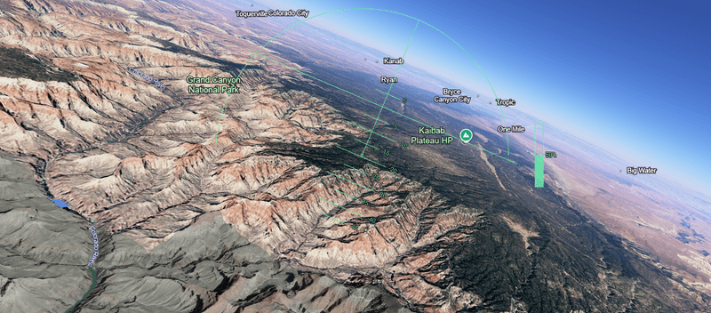


Google Maps has got fresh competition. Using machine learning, computer engineers have developed an interactive map that shows 3D models of the world's buildings – practically every single one of them. Here's how it works and how you can tinker around with it yourself.
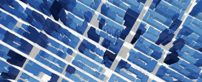
The rest of this article is behind a paywall. Please sign in or subscribe to access the full content.Called the GlobalBuildingAtlas, the freely available map features nearly all of the world’s 2.75 billion buildings, which presumably includes your home, your favourite restaurant, the hospital you were born in, and so on. Each structure is displayed with a resolution of 3 x 3 meters (approx. 10 x 10 feet), capturing the shape and size of each building with surprisingly good accuracy.
Around 97 percent (2.68 billion) of the buildings are displayed in the highest level of detail, plus the map contains buildings from regions often missing in global maps, such as Africa, South America, and rural areas.
So, how did they do it? A research team at the Technical University of Munich in Germany created the map by applying machine-learning models on high-resolution satellite images to automatically detect building footprints and estimate how tall each building is.
They then “fused” these AI-generated results with existing maps to improve accuracy. Finally, they put it all together to create simple 3D building models for nearly every building on Earth.
The largest previous global dataset like this contained about 1.7 billion structures, over 1 billion fewer than the new one. This, the university says, makes the GlobalBuildingAtlas “the most comprehensive collection of its kind.”
But bear in mind, it might not be perfect – it is made using AI, after all. The map features a small disclaimer saying: “This is a machine-learning-derived product. It may contain errors.”
The GlobalBuildingAtlas isn’t just a cool plaything to burn time during idle office hours and long bus rides. The researchers hope their work could be used for a variety of applications, from urban planning and disaster prevention to environmental studies and public health research.
"3D building information provides a much more accurate picture of urbanization and poverty than traditional 2D maps," Professor Xiaoxiang Zhu, project leader and Chair of Data Science in Earth Observation at the Technical University of Munich, said in a statement.
"With 3D models, we see not only the footprint but also the volume of each building, enabling far more precise insights into living conditions. We introduce a new global indicator: building volume per capita, the total building mass relative to population – a measure of housing and infrastructure that reveals social and economic disparities. This indicator supports sustainable urban development and helps cities become more inclusive and resilient,” she added.
It looks like the map is already proving to be very popular. When trying to access the map shortly after the research was published in December 2025, the website came with the warning: “Over the past few days, our web viewer has received nearly 280,000 access requests. Due to this unusually high traffic, some data may not load completely, which may result in a significant portion of buildings not being displayed.”
Looks like everyone has been trying to find their house. You can access the map here.
The new study is published in the journal Earth System Science Data.