

The COVID-19 pandemic is constantly evolving with new developments and reports emerging by the hour. If you want to get a reliable overview of some of the latest insights and figures, you can check out this live map and dashboard created to track the latest updates from the outbreak.
The dashboard was developed by the Center for Systems Science and Engineering at Johns Hopkins University in the hopes of providing the public with a clear picture of what’s going on with the situation as it unfolds. After all, false information can quickly spread in the haze of panic, from misleading reports to wildly inaccurate conspiracy theories.
“This dashboard provides an easy and accessible tool for anyone to have knowledge of the outbreak as it evolves, and also the ability to access all the data we are collecting for their own purposes,” Lauren Gardner, one of the main researchers working on the map from Johns Hopkins University's Department of Civil and Systems Engineering, told IFLScience in February. “Multiple regional authorities are also using it to inform, plan and prepare resources for those affected.”
As explained in a blog post by Johns Hopkins, the data is scooped from a number of sources, including the World Health Organization (WHO), the US Centers for Disease Control and Prevention (CDC), the European CDC, the Chinese CDC, various state or territory health authorities, and DXY, an online platform run by members of the Chinese medical community.
Updates to the dashboard are not instantaneous, although most of the data is gathered through a semi-automated living data stream that automatically updates regularly throughout the day.
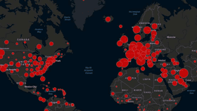
The dashboard reports cases at the province level in China and at the city level in the USA, Australia, and Canada. Other countries are currently reported at a nation-wide level. Confirmed cases are shown on the map with a red-orange dot – the larger the circle, the higher the number of cases. The right side of the dashboard also features the confirmed deaths and the number of recovered patients, along with a small graph highlighting the increased rate of cases, while the left shows the number of confirmed cases by country and region
If you want to learn more about the inner-workings of the dashboard, you can check out this study published in The Lancet Infectious Diseases.
Editor's Note: This is an updated version of an article originally published on January 28, 2020, which you can see here.