

Climate change dominates most of the headlines when it comes to our unfortunate addiction to fossil fuels, but air pollution remains as deadly as it ever has been. Millions of people per year die from pollution-linked cardiovascular and respiratory ailments, and now a new map shows you exactly how many years of your life you’re losing by breathing in your local particulates and aerosols.
A team of researchers, including those at the Energy Policy Institute (EPIC) at the University of Chicago, wanted to find a strong link between air pollution and life expectancy changes. Using smog-ridden China as a test bed, they found that when everything else is taken into account, such a correlation emerges.
The team looked at PM10, particulates emitted by vehicles and coal-fired power plants alike, whose individual particles are less than or equal to 10 microns in diameter – small enough to easily be inhaled and get lodged in the lungs.
As reported in the Proceedings of the National Academy of Sciences, for every 10 micrograms per cubic meter increase of PM10 in the air, a person will lose seven months from their life expectancy. For the even finer PM2.5, an identical increase shaves an entire year off your life.
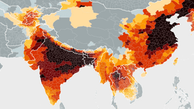
With this metric, they developed the Air Quality-Life Index (AQLI), an interactive map which shows how much longer you should be living in a world where the strict air quality standards set in place by the World Health Organization (WHO) were adhered to.

At present, 4.5 billion people (about 60 percent of the global population) are breathing in air that contains PM10 concentrations twice that of what the WHO considers to be safe, and clearly, it’s having a dramatic toll on human life.
Here are some of the worst offenders, with respect to the WHO Clean Air Act standards:
India – 4 years lost
China – 3.5 years lost
Pakistan – 2.5 years lost
The Democratic Republic of the Congo – 1.8 years lost
South Africa – 1.4 years lost
Chile – 1.4 years lost
Poland – 1.3 years lost
Indonesia – 0.9 years lost
Italy – 0.7 years lost
These are country averages, but the map also has a few spotlights on cities in China, India and the US. Here are some of the worst offending cities:
Los Angeles – 0.7 years lost
National Capital Territory of Delhi – 9 years lost
Agra – 8.1 years lost
Mumbai (suburbs) – 3.5 years lost
Shanghai – 5.5 years lost
Beijing – 6.4 years lost
Tianjin – 7.1 years lost
Although far from perfect, the US is doing a lot better in this regard than China and India. In Manhattan, for example, New Yorkers are losing almost none of their life to air pollution, thanks to the states strict air quality standards. Conversely, in China, 500 million residents in the north alone will lose 2.5 billion years of combined life expectancy.
[H/T: Quartz]