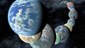


If you want to look at the incredible variety of exoplanets, this is your chance.
In the past, visual artists have produced infographics to show in the simplest way possible the ever-increasing number of planets and what we know about them. This latest iteration, called the Exoplanetary Orrery V, was created by Ph.D. student Alan Zucconi from Imperial College London. It presents all confirmed exoplanets with known orbits and temperature until January 2016. The visualizations also include the habitable zones (in green) for the systems based on the luminosity of the host stars.
There are over 4,000 confirmed exoplanets and many more potential candidates waiting for confirmation. An important goal is to find among them a planet similar to Earth. So far, we have found a few “cousins” of our home planet, but a true twin is still elusive. These visualizations show that any claim of a second Earth somewhere else in the Milky Way is still a bit premature.
“Something that I wanted to investigate myself was how close those exoplanets actually were to Earth, and most of them are actually very different,” Zucconi told IFLScience. “I've seen too many articles claiming that a ‘new Earth’ has been discovered... but the truth is that this visualization shows how different these ‘twin’ planets actually are.”

Some of the systems from the Exoplanetary Orrery V. The green region is the circumstellar habitable zone. Alan Zucconi
The Exoplanetary Orrery V reproduces temperatures, stellar types, elliptical orbits, and the habitable zones of the exoplanetary systems. Distance and planetary size are also included, but the scaling is different for simplicity. Planets are considerably smaller than the distances to their stars, so they were made signficantly larger.
The Orrery is based on data from the Nasa Exoplanet Archive. As more data becomes available, the Orrery will be corrected.
“I got the data last month, but I keep on updating it,” said Zucconi. “So, I’ve only included all confirmed exoplanets for which the data plotted was there. Although not all the exoplanets have known eccentricity, so in those cases I plotted [the orbit] as a circle.”
You can check out the full scope of infographics at Zucconi's website.

How the Solar system looks in the Exoplanetary Orrery. Alan Zucconi