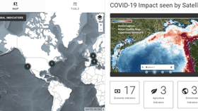


Three of the world's space agencies have teamed up to create an interactive dashboard map that displays the planet-wide changes brought by the ongoing Covid-19 pandemic.
The rest of this article is behind a paywall. Please sign in or subscribe to access the full content.The COVID-19 Earth Observation Dashboard was created by NASA, ESA (European Space Agency), and JAXA (Japan Aerospace Exploration Agency) to analyze the recent changes in air quality, water quality, measures of climate change, economic activity, and agriculture. Using a wealth of data gathered from their combined satellite fleets, the dashboard is designed to explore how the environment and human life have been profoundly affected by the Covid-19 pandemic, looking at everything from air quality in Los Angeles to asparagus harvests in Germany.
“Together NASA, ESA, and JAXA represent a great human asset: advanced Earth-observing instruments in space that are used every day to benefit society and advance knowledge about our home planet,” Thomas Zurbuchen, NASA associate administrator for science, said in a statement.
“When we began to see from space how changing patterns of human activity caused by the pandemic were having a visible impact on the planet, we knew that if we combined resources, we could bring a powerful new analytical tool to bear on this fast-moving crisis.”
Improvements in air quality around the world were among the most instantly noticeable changes brought by the introduction of lockdown measures earlier this year. One air pollutant that’s released by burning fossil fuels, nitrogen dioxide (NO2), has a lifetime of a few hours so it’s often used to analyze short-term changes in air quality. If you take a look at the map and see how air quality changed in Europe, you'll see that cities including Paris, Madrid, Rome, and Milan all saw a significant dip (around 50 percent) in NO2 concentrations around April-time compared to the same months in previous years.
It’s also possible to get insights into the decline of global economic activity from the pandemic. Satellite observations that log agricultural output, activity in ports, the number of cars parked at shopping centers, and so on can be used as indicators of how certain industries have been damaged by the lockdown. For example, if you click on the dot within China, the dashboard map shows how a car factory output in Beijing experienced a dramatic slump in January, February, and March, before slowing rising again.
If you need a few pointers on how to make the most of the dashboard — it can be a little bit fiddly at first — then check out the tutorial provided by NASA below. You can find the dashboard at eodashboard.org.