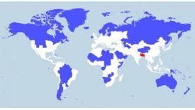


The image above shows where 10% of the world’s population inhabit; 5% are in the blue area, 5% are in the red area and the remaining 90% are in the white area. There are high concentrations in the Northern Hemisphere, while in the Southern Hemisphere, the entire middle of South America and Australia are completely covered in blue.
Created by Max Galka in response to a chart created by redditor Ibisdigitalmedia, the map shows the highest densities of populations around the world, specifically South Asia (the small red area).
Though overpopulation in South Asia does come with the issues of a populace leaning too hard on its country’s resources, Galka remarkably doesn’t see it like that.
“If anything, I see South Asia’s dense population as a positive thing. It is very efficient economically, socially, and environmentally for people to live in dense population centers,” Galka said to io9. “And a movement out of rural areas into cities is a trend that is happening everywhere in the world, even in India and Bangladesh. So in that sense, they are ahead of the curve.”
If you too would like to have a tinker with the data, it’s all available on Galka’s website.
[H/T: io9]