


Spare a thought for the old Mercator projection, because it’s been having a troubled time of late.
Yes, everyone’s favorite pastime on the Internet (stretching back to that West Wing episode) is tearing apart Flemish cartographer Gerardus Mercator’s 1569 projection limb by limb, showing how it over and under exaggerates certain countries.
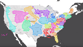
And that’s the focus of this video from RealLifeLore, which explains why the widely used maps we use today are not very accurate at all. It explains how certain countries like Greenland are massively bloated, while others like Australia are under-appreciated.
The video seems to be based on this Reddit post from earlier in the year and this Buzzfeed post, but it's still worth a watch.
Just go easy on Mercator, will you.