


Even today, with all our satellites and the latest computer software, creating an accurate map of the world is virtually impossible. Firstly, you have to accept that you’re turning a three-dimensional shape into a two-dimensional image. Then comes the problem of social and political biases that might further alter a perception.
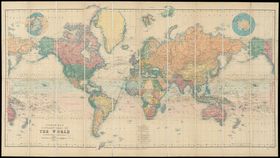
The rest of this article is behind a paywall. Please sign in or subscribe to access the full content.The map of the world you are most familiar with – the Mercator projection map (above) – is notoriously bad for this. To account for the world’s curve (sorry Shaq, the world is definitely round), this projection exaggerates regions that are far from the equator, hence making the US, Europe, and Russia appear larger than they are.
That’s why Boston schools are going to chuck out this “conventional” world map and opt for the alternative Gall-Peters world map. Last week, the Boston Globe reports, at least 600 public school classrooms received their deliveries of the maps in an effort to shift the way kids see the world.
However, the decision is being guided as much by politics as it is scientific accuracy.
 Gall-Peters world map, soon to be seen in Boston classrooms. Strebe/Wikimedia Commons
A lot of the early world maps were created by Northern Europeans. The Mercator projection map of the world, for example, was created by the Flemish (from Flanders, the Dutch-speaking region of Belgium) cartographer Gerardus Mercator in 1569. When you reduce a 3D shape into 2D, something’s got to give. Critics argue that the early map creators didn't want to compromise their homeland of Europe, so instead, they shrunk down Africa and South America. This, in some minds, is symbolic of putting Europe at the center of the world and harks back to the age of colonialism.
“So this is about maps, but it isn’t about maps,” Colin Rose, assistant superintendent and head of the Boston Public Schools’ Office of Opportunity and Achievement Gaps, told the Boston Globe. “It’s about a paradigm shift in our district. We’ve had a very fixed view that is very Eurocentric."
That said, the old Mercator projection does have its practical perks. On the whole, it’s one of the simplest maps to navigate around because the angles from point to point remain fairly accurate.
The proponents of the idea hope it will spread to public schools in other states. A similar drive has also been taken up across the pond in Europe. The Gall-Peters world map is now promoted by the United Nations Educational, Scientific and Cultural Organization, and is widely used by the British state school system.
Rose also thinks this is a great way to start a conversation in schools: "How do we talk about other viewpoints? This is a great jump off point."