


Fractals occupy a weird place in math. They’re these abstract windows into the quantum realm, sitting somewhere in between two and three dimensions and claiming to prove that the UK coastline is infinitely long even though any map will show you that it isn’t … and yet they’re also surprisingly practical. Take the Mandelbrot set, for example:

You’ve likely seen this pattern before, but have you ever wondered what it actually means? Despite its psychedelic presentation, the Mandelbrot set has a deep connection to the world around us – and it’s all down to a family of mathematical equations collectively known as the logistic map.
What is the logistic map?
The logistic map is famous in math circles. It originated back in the first half of the 19th century as a way to model population dynamics, but it’s evolved into one of the best examples of how random chaos can arise from what looks like a simple starting point. Mathematically, it looks like this:

In English, that says “you get the next number in the sequence by multiplying the current number by some constant r and one minus itself,” and so … actually, you know what – maybe it’ll be easier with an example.
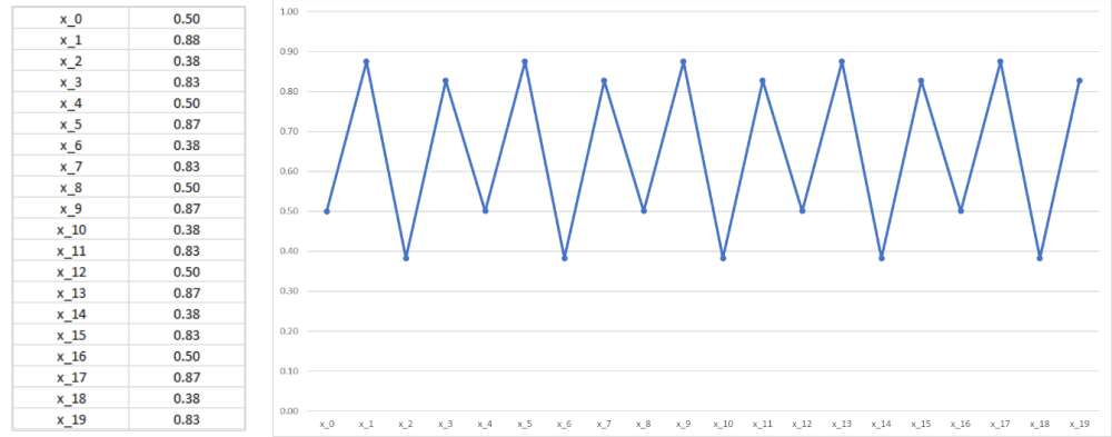
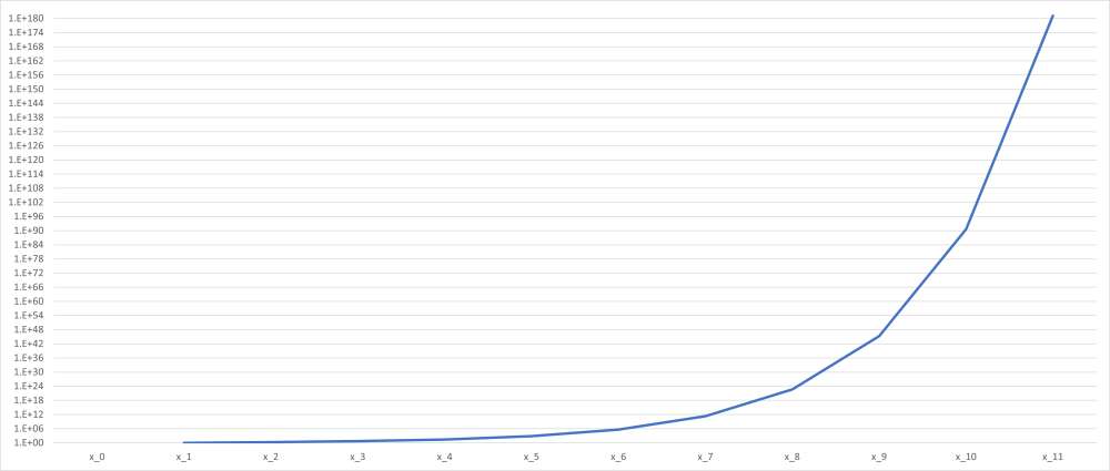
Let’s choose as our starting point x0 = 1/2 (we’ll always choose a value between zero and one for our starting point, and 1/2 is nice and central) and we’ll set the value of r to be [spinning roulette wheel] 3. Then the map will give us
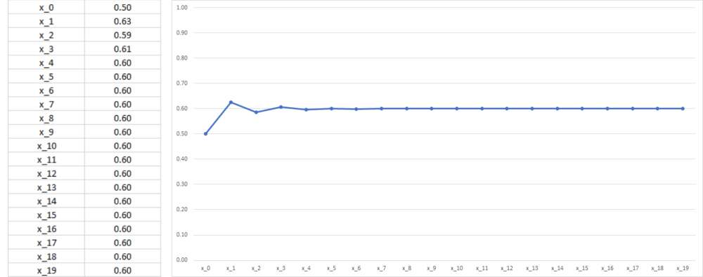
On the other hand, if we set r = 2.5 we get
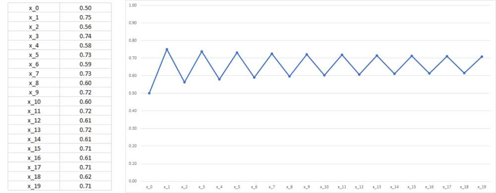
And if we increase r up to 3.5 we have
Remember, the logistic map started as a way to model population dynamics, and that’s a pretty good way of thinking about what’s going on here. Let’s suppose we’re modeling how a colony of rabbits changes over time: then the logistic map tells us that how many bunnies we have tomorrow depends on how many we have today together with the reproduction rate of the population – how fast they, ahem, make new bunnies. The more bunnies we have, the more there are to reproduce, so we multiply the reproduction rate by the number of bunnies in the current population, xn. But if there are too many bunnies, the food will run out, and some will be forced to leave (or starve). That’s where the (1 - xn) comes from – it reflects the fact that there’s only so many bunnies that can live on one hill before they simply become too successful for their own good.
The logistic map, despite being quite simple on the surface, gives us a surprisingly good prediction of observed population dynamics in the real world. In other words, the graphs above were obtained using pure math, but under the right circumstances (specifically those relating to bunny thirst) they would look very similar to real-world data on bunny populations.
Ok great, but what does this have to do with the Mandelbrot set?
Well, forget about the x values and think of the logistic map as a function of r. It doesn’t take long before you start to see some strange behavior going on.
Let’s start at r = 0. Between zero and one, the logistic map is doomed to fizzle out to nothing.
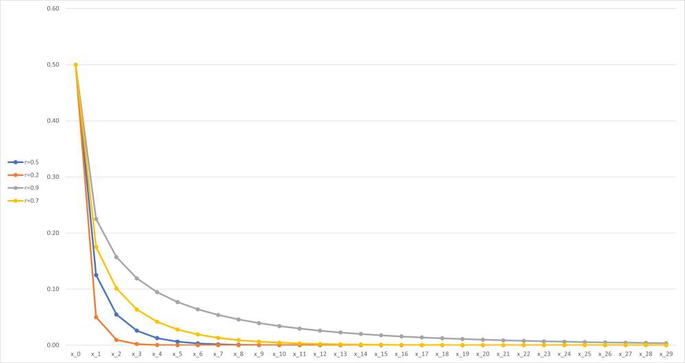
The picture changes when r reaches one. Between one and three, the logistic map will take you to a particular value, regardless of what you chose as your starting point. Sometimes it’ll get there fast, sometimes slowly, and sometimes it’ll wiggle around a bit before it gets there, but it’ll always end up at the same point (which for the nerds in the audience is equal to 1-1/r).
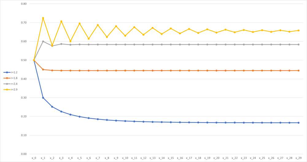
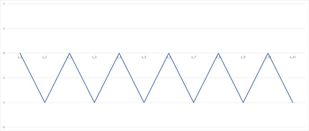
But at r = 3, something interesting happens: the logistic map starts to oscillate. Basically, the values you get start to jump between two fixed points.

This continues until you get to r ? 3.44949 (in exact form, r = 1 + ?6), when you start to see four fixed points.
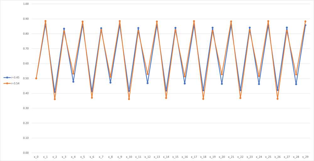
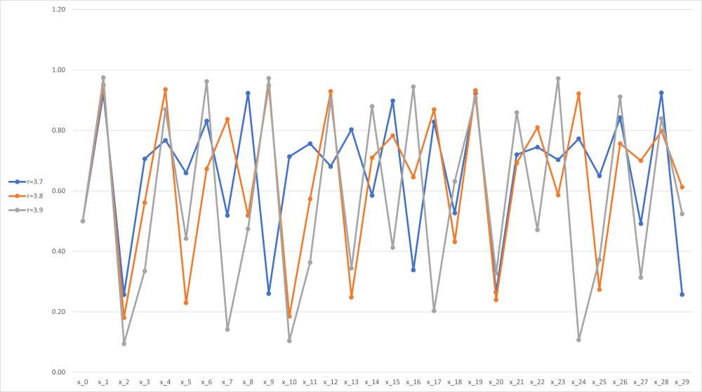
Then at r ? 3.54409, it happens again, and then again and again with the number of values in the chain doubling each time. This continues until you reach the magic number: r ? 3.56995, which is when everything kind of … breaks.
Now for the incredibly cool part: if we plot a graph of r against xn, letting xn increase, we get this:
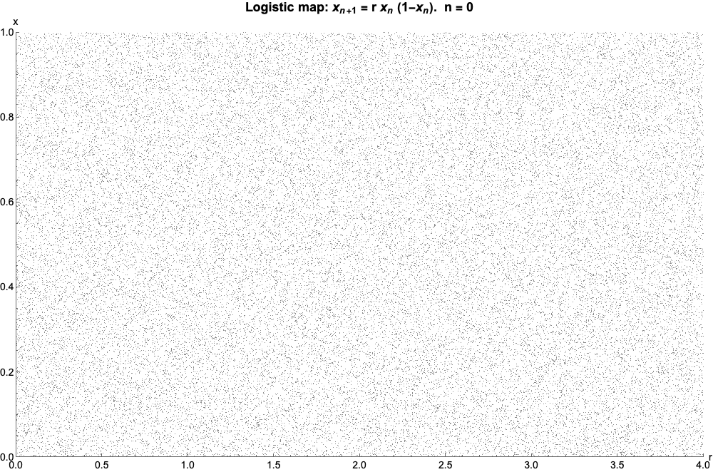
Which, if we let n shoot off to infinity, looks like this (called the bifurcation diagram for the logistic map):

And that, friends, is the Mandelbrot set.
No, seriously. See, the Mandelbrot set is also governed by a recurrence relation – that is, a rule that gives the next number in a sequence by doing something to the number you’re at. For the logistic map, remember, the recurrence relation is

But for the Mandelbrot set, it’s

Now, here’s where things get a bit technical. It may sound obvious, but we’ll say it anyway: the logistic map is a map, but the Mandelbrot set is a set. Mind-blowing, we know. But that difference is crucial because it means that they’re telling us two very different – almost completely opposite – pieces of information. While the logistic map asks you for some starting values and gives you back oscillations (if you’re lucky), the Mandelbrot set instead says “we only want oscillations from this recurrence relation – which starting values are going to give us them?”
Let’s look at an example again, to help us understand: let’s take z0 = 0 and c = 1. Then we find
The sequence gets larger and larger without bound, so c = 1 isn’t part of the Mandelbrot set. On the other hand, if we leave z0 = 0 and set c = -1, we get
The values oscillate between 0 and -1 – so c = -1 is part of the Mandelbrot set. Get it?
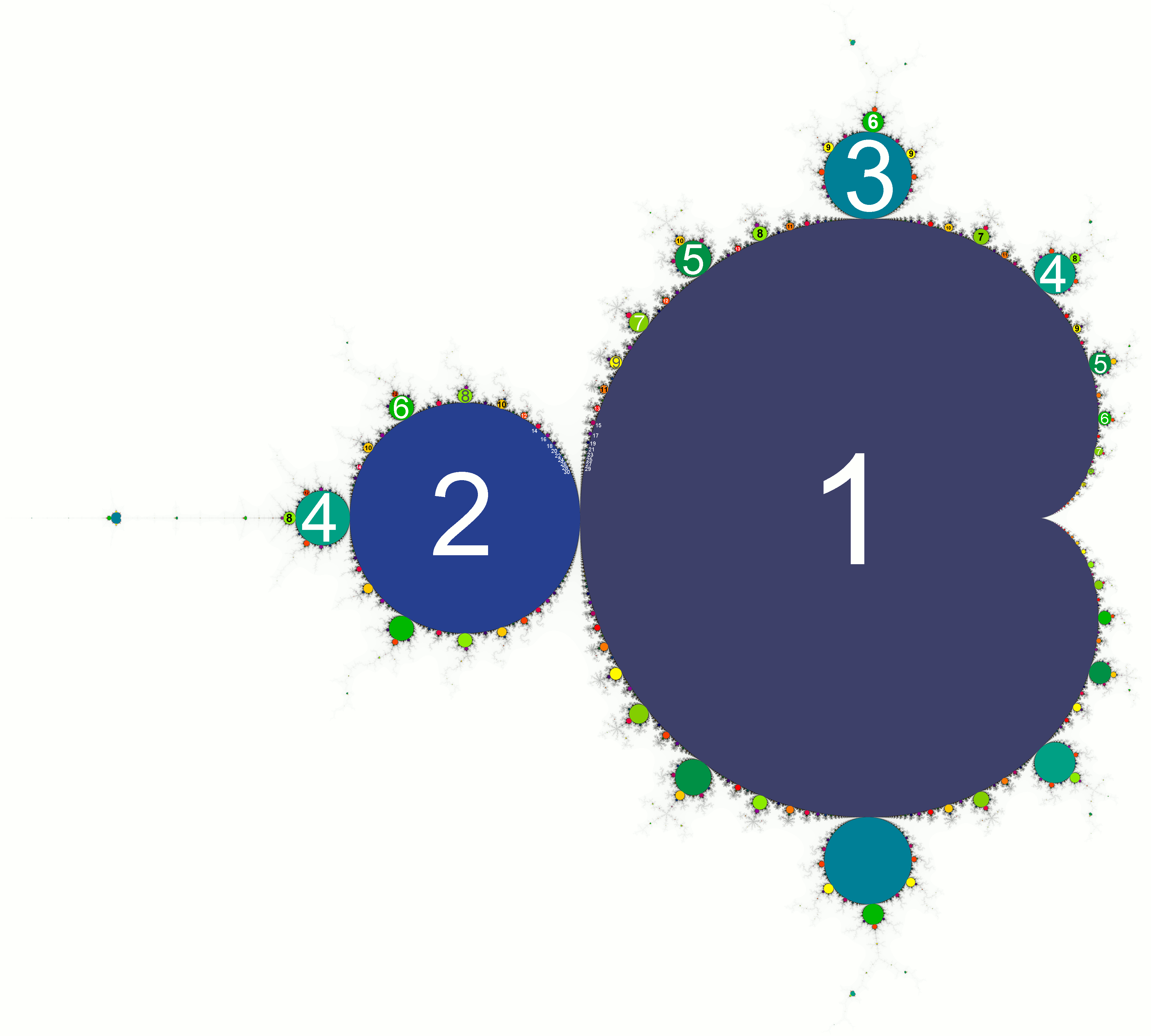
Well, we won’t go into detail, but take our word for it: if you plot out on a diagram all the complex numbers c that give a bounded sequence from the recurrence relation, you get this:

But what if we want more information than that? What if we want to know not just which values oscillate, but how they oscillate?
Well, that’s where the magic happens. See, you may have noticed earlier that we described the Mandelbrot set as a set of complex numbers. If you don’t know what they are, don’t worry – they’re basically just a way of extending the number line to include values that can square to negative numbers. But their main feature is that they are two-dimensional – not a point on a number line, but somewhere in a graph.

But that means that a function or recurrence relation which is applied to complex numbers can’t give a nice two-dimensional graph like the bifurcation diagram we saw earlier – the horizontal “axis” is actually a plane. Instead, we have to turn the diagram on its side, and when we do that, we see something literally awesome.

The logistic map! And this isn’t just some graphical jiggery-pokery – you can get from one to the other using cold hard math if you really want to. Remarkably, the points at which the logistic map splits correspond to the boundary of the Mandelbrot set where it crosses the real line – you can even see the area of logistical chaos represented by the Mandelbrot set’s “needle”.
But the Mandelbrot set isn’t only the logistic map – that’s just the bit that lies along the real axis. So while the main cardioid – the biggest, heart-shaped section of the Mandelbrot fractal – corresponds to the unique part of the logistic map and the main bulb – the second-largest piece of the fractal – corresponds to the part of the map that oscillates between two values, and so on down to four, eight, 16, and so on, there are also parts of the Mandelbrot set that aren’t represented at all by the logistic map. Parts like the biggest bulb sitting on top of the main cardioid – values in this section oscillate three times. Slightly to the left of that is a bulb that contains values that oscillate five times. In fact, you can pick any positive whole number you like, and somewhere in the Mandelbrot set you can find values that oscillate exactly that many times.
The Mandelbrot set has a whole host of awesome qualities, many of which can be seen in this epic Veritasium video, but its connection to the logistic map is arguably one of the most fascinating – if only because it encapsulates so much of what makes math awesome.
Let's face it: in what other scientific field could you take a group of horny bunnies and come up with something as abstract and beautiful as the Mandelbrot set?