


A font has been created to improve memory retention, combining past research on memory enhancement and design expertise. Preliminary testing shows that when information is conveyed in this font, dubbed Sans Forgetica, participants retain a small but significant extra portion of what they have read.
The rest of this article is behind a paywall. Please sign in or subscribe to access the full content.Previous studies have shown people are more likely to remember information when the brain has been forced to make an extra effort to absorb it in the first place. On the other hand, if something is too hard to read many won't bother, or will never manage to understand much of what's on the page.
A team of psychologists and designers at Australia's RMIT University decided to combine their skills to produce a font that hits what Dr Janneke Blijlevens calls the “desirable difficulty sweet spot.”
“Most fonts are designed to be easy to read,” Blijlevens told IFLScience. “We had to deliberately break the usual design principles to make a font that was more difficult.”
Blijlevens and colleagues created three new hard-to-read fonts and tested people's responses. In the tradition of Goldilocks, they found one of their creations was too easy, being only slightly harder to read than normal fonts, while another was too hard.
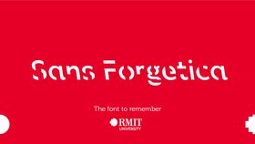
In between, Sans Forgetica, a modification of Albion, has a backward slope, like a reverse italic, and is missing small pieces of each letter.
The authors then presented 303 students with information partly in Arial and partly in Sans Forgetica, before giving them a multiple choice test on what they had learned. The work has yet to be published, and so far the team hasn't tested Sans Forgetica against a wider variety of other fonts. Nevertheless, Blijlevens told IFLScience there was a statistically significant difference between the 50 percent memory success for the information in Arial, and the 57 percent achieved for the Sans Forgetica component.
Blijlevens added that the team originally conceived Sans Forgetica as something students could use for writing study notes in preparation for exams. However, as a lecturer she also sees potential for teachers to highlight the parts of their lessons they most want students to notice.
“It's never been our intention to monetize this, I believe knowledge should be free for all,” Blijlevens added. Consequently, the university has made Sans Forgetica free to download.
Blijlevens acknowledged the backward sloping aspect of Sans Forgetica is probably only effective because of its rareness. Her colleague Stephen Banham has noted this feature is otherwise only used by cartographers to name rivers. Blijlevens suggests “using it wisely”, as its benefit is likely to wear off. However, Blijlevens thinks a font with gaps in its letters is never likely to become truly easy to read, and therefore Sans Forgetica will maintain some of its power.