


If you’re anything like us, you probably grew up thinking of the world like this:
The rest of this article is behind a paywall. Please sign in or subscribe to access the full content.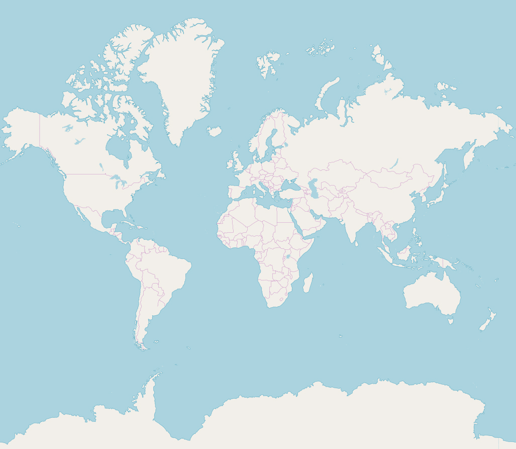
Ah, the good old Mercator projection. It’s been with us since 1569, and it’s taught us everything we know. Like: Greenland is bloody huge, isn’t it? Look at it, up there, suspended ominously above Canada like that. And now we come to think of it, check out the size on that Great White North. It must be bigger than the whole of South America! And would you look at the icy mama jama that is Antarctica. Global warming schmobal schmarming – that thing is an Absolute Unit.
But as you probably know by now, it’s all a lie. The world actually looks nothing like that – that’s one reason why Google recently ditched its Mercator-based map to show the planet in its notoriously globular true form. See, while the Mercator projection is great for telling us the shape of the islands and continents that sit on the Earth’s crust, it’s really, really bad at telling us their size.
The problem, basically, is that there’s no good way to represent a globe in 2D. You can preserve area, like the Gall-Peterson projection, but then you’re left with a map full of countries that have been squidged about into odd shapes. You can try an azimuthal equidistant projection, but that’s pretty unhelpful in most respects unless you like great circles or representing the UN. So we tend to stick with the Mercator, and ignore the fact that it makes countries look larger and larger the further you get from the equator.
Luckily, we live in a golden age of playing around on the Internet. And this week, Twitter user ‘Starlightgeek’ went viral when they used the website The True Size to do just that.
Okay, this may come as a surprise to our European readers, but the USA is huge. I mean, yeah, it looks big on a normal map, right? It’s even bigger than that.
This is why so few USians don’t speak another language, Starlight points out. After all, if you drive 1,000 kilometers from Paris, France, you can pass through six countries and dozens of linguistic borders. Drive the same distance from Paris, Texas, and you don’t even have to leave Texas.
Meanwhile, Canada has been lying to us this whole time. It’s still big, sure, but it’s nothing like what you thought.
It’s not all that much larger than Brazil, it turns out. Which, by the way, is way bigger than you ever realized.
Russia is big – but not as big as you think.
And Greenland is not, as the Mercator makes it seem, as big as Africa. Greenland is kind of small – about a third the size of the contiguous United States:
While Africa is just HUGE. Like, “can fit the USA, all of Europe, India, China, and Japan inside it and still have room left over” huge.

And remember Antarctica? That vast imposing land mass taking up the entire lower section of the map? Here it is at the equator.

Oh.
As Starlight points out, our reliance on the Mercator map doesn’t just mess with our geographic intuition – it can distort our perception of historical achievements too.
But what’s the best way to avoid the geographical fake news delivered by the Mercator projection? There’s a simple answer – but it won’t fit in your pocket, we’re afraid.