


The map you grew up with has been lying to you about the true size of countries.
Representing a 3D world on a 2D map is always going to end up with some issues and some compromises. No matter how accurate you try to make it, you will end up with stretched areas, squashed countries, or else parts of the map cut out altogether.
The map you are likely familiar with is one based on the Mercator projection, created by cartographer Gerardus Mercator in 1569. It's a cylindrical map projection, in which you place the globe into a cylinder and then project each point of the map onto a corresponding point on the cylinder. Meridians (imaginary vertical lines going through the Earth from the North to South pole) are mapped onto vertical lines equally spaced apart on the map, and circles of latitude (imaginary horizontal lines from East to West) are mapped onto equally spaced horizontal lines.
The Mercator projection is good for navigation because it represents courses of constant bearing as straight segments, meaning ships have to course correct for the curvature of the Earth less frequently. However, it also results in distortions of size and shape.
In cylindrical maps – as is the case with the Mercator projection – areas around the equator remain roughly accurate, but the further you move from the equator, the more distorted and inflated landmasses become. Essentially, this is why Greenland appears gigantic and is represented as the same size as Africa, when in fact it's 1/14 as big. The animation below gives you a quick look at the distortions in the map you're used to.
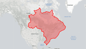
However, there's nothing quite like playing around with a map for yourself and finding out how big your own country is in relation to everything else. One interactive map that's been doing the rounds over the last few days is The True Size Of... You can select the country you're interested in comparing and drag it over other areas of the map to see how big it really is.
I highly recommend you first compare it to Greenland, just to see how disproportionately large it is on maps, before losing the next few hours of your life.
The map is based on the Gall-Peters projection, a rectangular map projection that prioritizes giving areas the correct sizes in relation to each other over being useful as a navigational tool. So enjoy, don't use it to navigate the Atlantic.