


Population density maps are always good fun. And this one showing US states is no exception.
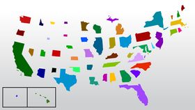
As picked up on Reddit (the original is on Wikipedia), this map shows what each state would look like if you resized each state according to its population. That Wikipedia page has a handy breakdown of how it was calculated.
The most populous US state is California, with a whopping 39 million people, which makes it one of the largest on this map. In terms of area (424,000 square kilometers), though, it’s only third behind Texas (697,000 square kilometers) and Alaska (1.7 square kilometers).
Texas too does pretty good in the population density map (28 million people), as does Florida (21 million). And New York (20 million) gets a sizeable boost, from a small sliver to one of the bigger states in the northeast. Hawaii, meanwhile, stays pretty similar in size.
But the biggest mover is no doubt Alaska. Its huge area and relatively low population of just 742,000 sees it shrink from the biggest state to one of the smallest, with the lowest population density of all. Only Vermont (625,000 people) and Wyoming (585,000 people) are worse off in terms of population alone.
It’s just a bit of fun, sure, but it’s pretty interesting to look at. For comparison, here's an actual map of the United States, and the population density one again so you can easily compare them.

