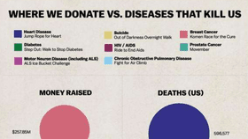


Julia Belluz created the infographic below to compare how much money is donated to fight various diseases and how many people in the USA die from those same diseases for an article in Vox.

The graphic has since developed a bit of a life of its own. Belluz uses it to critique celebrity-driven campaigns for rare diseases such as the ice bucket challenge for ALS, compared to more frequent, but less glamorous conditions
The discrepancy the graphic is pretty striking, and certainly worth thinking about, but it's hardly the last word. For example, HIV may not be a major killer of Americans, but the people donating are probably concerned about the devastation it wrecks globally. Indeed the article quotes 80,000 hours founder William MacAskill saying, "Donating money to the best developing world health charities will reach at least 100 times as many people than if you donate to developed world health causes."
It's also relevant to think not just about numbers of deaths, but numbers of years lost. It is understandable that people will treat a disease that kills children more seriously than one that most affects people who are nearing the end of their lives.
Timing is also an issue. The figures Belluz uses from the Centers for Disease Control for 2011, but things can change. Back when the AIDS epidemic was just taking off some critics said too much funding was being directed to it for the relatively paltry deaths. Possibly motivated by homophobia, they ignored the fact that death rates were rising – and the donations reflected the future danger, as much as the deaths at the time.
Its certainly good to think about the way your donations can have the most impact, and if you're looking for help with that there are some great websites available. In particular, while all charities have overheads, some deliver a much, much larger proportion of the dollars they receive to where it can make a difference than others.
However, high profile events like the ice-bucket challenge tend to disguise how little relatively wealthy people actually give away on average. If we spent as much on fighting disease as we do on bottled water to pick just one example, we'd have beaten most of these long ago.
Update: We've been notified that, while the numbers in the Vox graphic appear to be reasonably reliable, the geometry was not, with the figures scaled to the diameter of the circles, not the area. This exaggerates just how much bigger the largest donations, and deaths, are. Vox has rescaled it and we've now used their corrected figure. Thanks to Chris@osric.com for pointing this out. There is definitely a big discrepancy between deaths and donations, but there is no reason to exaggerate it.
Read this next: Is the universe a hologram?